WISDOM AT THE CROSSROADS PODCAST.
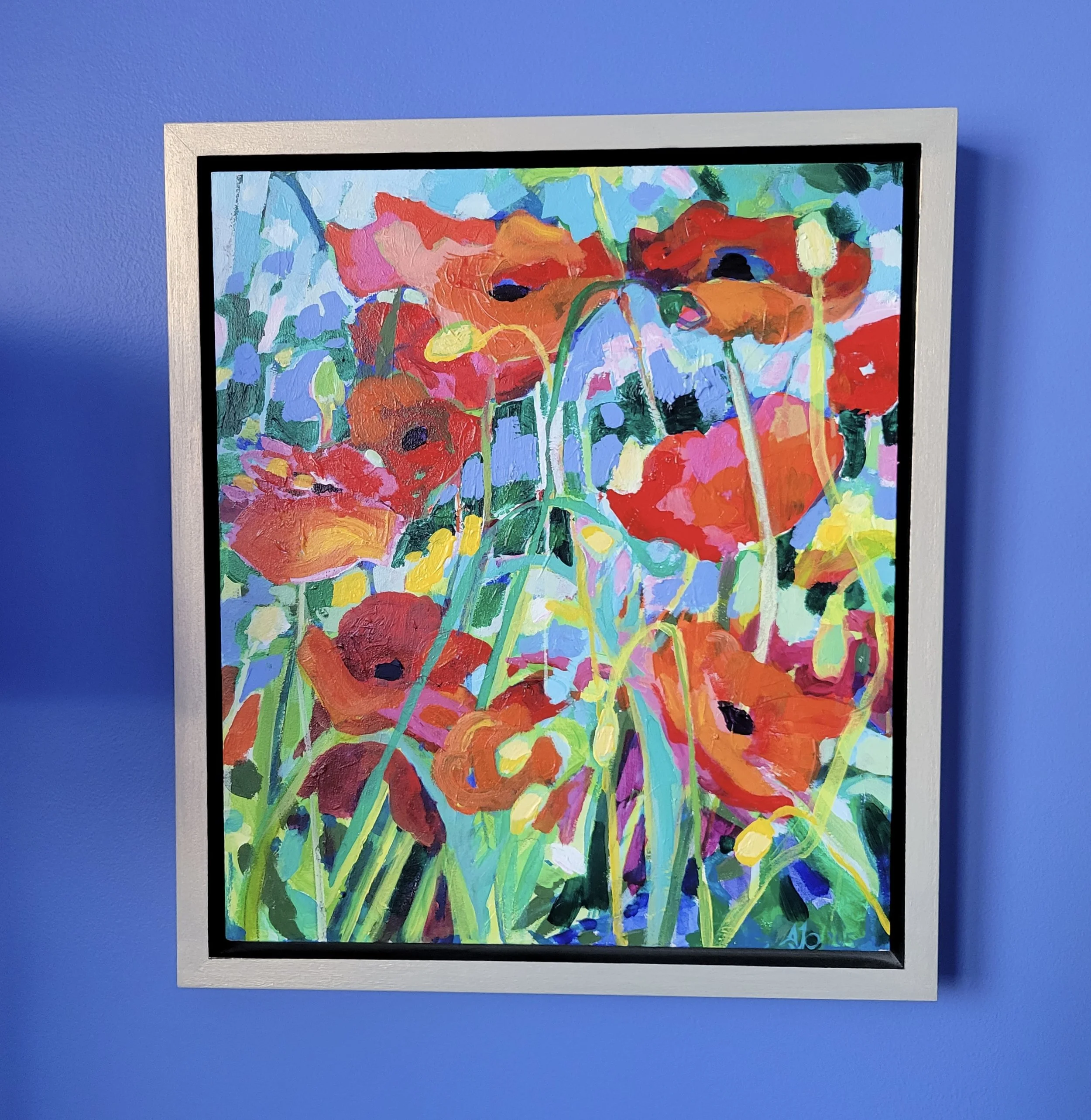
The jostling characters of this small but feisty composition, 13” x 14”, on panel, affectionately titled “Shrinking Violets compete for attention and visual elbow room. In this fictitious perennial garden, full of vibrant colour grants an introduction to new beginnings that merge a path of discovery and experimentation with textiles and technology.
We learn the value of a good reading list and friendships; in life, art and business. We also discover that red is delicious no matter which way you serve it.
Join me to discover some creative magic along the road less travelled.
The meditation begins at 10:00 In the recording. This one comes from the child within me. It takes us on an imaginary journey through “Adventure Island” and passes through a threshold to interact with a version of ourselves.
I hope you’ll join me as we; visualize. Reflect and project; to seek awareness, connection and gratitude, together.

SHRINKING VIOLETS, 13” x 14”, Acrylic on Panel, 2007
“Shrinking Violets” is a small composition by my standards. She doesn’t take up much room physically though visually she packs a bit more punch and carves out a little more elbow room for herself than we might think she would need.
` The subject is a sunny clatch of energetic blooms competing for space and resources in a rambling garden vignette. They have that rambling english garden feel, more kitchen garden than formal border. At 13” x 14”, painted in acrylic on panel, what she lacks in size she more than makes up for with intensity.
The composition features exuberant characters that range from poppy like blooms to the suggestion of a rose. The trio of red, yellow and blue are well represented though the yellows are earthy and lemon, the reds are clear and demanding while the blues are dominantly mid ranged and intense. There is nothing subtle about these “Shrinking Violets”.
The composition has some diagonal elements that help to suggest movement within the squabble of garden girls competing for attention. At the time I painted this series I was also exploring work in textiles, the duel arms of my studio practice were developing yet also merging in new ways. I had applied for and was awarded an arts council grant to support my explorations that sought to find a way or ways to transfer my painterly signature to fabric. I had been advised on more than one occasion to make a choice to find my voice in one media instead of spreading my limited work time thinly across both. I couldn’t do it then and i don’t think I can now, so instead I sought ways to find common elements between the two that i could elaborate on in some way.

Shrinking Violets Yellow Detail
My inexperience with blurred boundaries in my studio practice might have mimicked my issue blurring the lines between personal and public space. In my defence though, if you had wandered into my front yard to photograph my garden i would probably have made you a cup of tea as we visited and sent you home with a cutting or two and some seed heads.
I mention the Tresspassing series again in this episode because it was timely, the paintings of that series were small and portable and miraculously fit the limited space of the scanning bed I was able to access for my experiments. I needed to get an extremely high definition image of an example of my work. “Shrinking Violets” was an image that was current at the time, incorporated a wide colour range and she fit the scanning bed. That made her the perfect candidate for my initial experiments into reprographic processes.
So why bother? Why go to all this trouble? Why couldn’t I just paint on fabric in the same way I painted on canvas or panel? Well, Painting with dye on cloth produces a watercolour effect where the colours bleed or diffuse across the surface and soften into a delicate effect. The word softness was not a word many if any would apply to a description of my work in acrylic at the time, or now for that matter. Watercolour is soft and delicate in comparison to the energetic and bold, some might say intense compositions that evolve at the end of my paintbrush.
I could achieve some of the intensity of acrylic on panel painting on fabric, by adding mediums to the colour . That might help the intensity and show the action of the brushstroke more effectively but the surface would become so hard and dense that i could no longer machine stitch through it. Breaking or gumming up needles as i tried to add machine stitching stalled my progress.
When the process of dye sublimation was introduced to me by a knowledgeable and supportive local firm I was excited about the potential of our collaboration. In fact i have continued to be inspired by this local company and I have maintained a working relationship with them since 2009. Shrinking Violets had the colour range I thought would be a good place to start and as well she has several areas within the composition that i like to refer to as Compositional seeds. These were areas of interest that i could see becoming compositions in their own right once moved through changes in media and scale.

Shrinking Violets Red Detail
Once the image was processed and I had a high res scan to work with we began with reds and the largest floral like area at the bottom right of the painting. The project became known as “Seeding apples from oranges” partly because my photographer Rob was reading a seed catalogue at the time I was photographing the trespassing series work with him. And partly because I was creating a secondary image from areas within the original painting.
The grant project was about visual comparisons between two similar yet very different media so the project ended up with the handle, “Seeding Apples from Oranges”
Names can be tricky, they can be literal or they can be descriptive. The first test print of the series was inspiring, the reds were delicious and so “Red Delicious” , the name of a variety of apples from the seed catalogue became the working title of the art quilt that evolved out of the process.
The name game can definitely be a tricky one. I always want to provide a secondary was for a viewer or client to make personal connection to the visual image they are seeing. Sometimes that might be a song lyric, a description, something humorous or sometimes a cheeky reference to some kind of perceived personification of an inanimate object. Other times I have named paintings with the help I am offered from requests put out on my instagram. Kaleidoscope and Wonderland are both recent examples of that name game. I don’t have the advantage of using my photographer Rob’s extensive vocabulary and interesting reading list to help me with titles now that he has moved well north of the city.
(Above: I recently came across a long ago client who shared this snapshot of her painting with me as a reminder. This little sister also grew out of the Trespassing series.)
I know I am getting off on a tangent here but I should tell you that the finished art quilt “Red Delicious”: did end up as a new beginning or a heading in a new chapter of my studio practice on the textile side. I kept her and hung her in my bedroom so that i woke up to her flowing red gestures and meandering machine stitching lines that helped to bring out the energy of the brushstroke on fabric. I have kept the first of many projects for the lessons they have taught me as my creative journey has developed and that’s where this podcast began, sharing the backstories illustrated through these various projects. “RED DELICIOUS” found a home last spring and though i was reluctant to let her go everyone needs to fledge at some point. She could not have found a more comfortable home. Some things are just meant to be. See her insitu below.

The original “Shrinking Violets” also inspired a 39” square quilt i called “Shrinking Violet” because the focus was on a singular image within the painting and not the entire gaggle of competitors from the original image. This quilt happens to be draped over the railing in the kitchen right now??? , handily Its label reads…
The dye sublimation process has allowed me to transfer my painterly signature to fibre without compromising the materiality of the paint or the malleability of the fabric surface. From the leftovers of the last is where the next begins I like to say. See this yellow quilt below shown in context with the original painting.
It is amazing how much material we can gather from a single image. In fact those compositional details are often my favourites. They work their magic and draw me in to pay attention every time. I still have designs on examining these poppers as we called them when my girls and their friends were little and jostled to join me in my sewing room to play with colour and fabric. at bay feet on the floor as I worked. One day i hope i might get to act on the lengthening list of ideas that keep me at work at play in my studio.

The cast of “Adventure Island”. A vignette from this children’s TV show was the inspiration for today’s meditation.
.Being away from the studio this week, my painting schedule has had to adjust to my absence and put a few commitments on the back burner while i took in the inspiration of a new landscape and allowed myself to be present . I got to take in some lovely sea air. which for me is always restorative. Change is good and travel is better. Let’s hope this returning trend continues. for us all and fills us with inspiration to interpret the coming season in colour.
So, before we head off to take in th meditation here are some takeaways from todays chat:
Colour can pack a might punch no matter what the size.
Big isn’t always better
There is so much to explore we can’t possibly be confined to a single focus so let’s not beat ourselves up when we have squirrel moments. you just never know what magic we might discover in the road less travelled on our creative journeys.

The meditation offers a choice today.

Where do your preferences lead you?
The meditation is a sweet one this week. Writing it took me back to childhood dreams. We didn't watch a lot of TV in my house growing up but “Adventure Island” in Australia was always a highlight.
The story I would like to offer you comes from the small child within me. The one that was enthralled to watch a little show on Saturday mornings. Adventure Island was not about an island at all. For me it was magical and i loved every opportunity i had to watch it. In one of the regular segments three different shaped windows or mirrors filled the screen in a neat row. The trio included: a rounded arch, a tall rectangle and a large oval segmented window frame, The camera eventually followed a route into one of the shapes and a vignette would be revealed after we crossed the threshold of the opening where a visual story would play out. It could be kids at play or maybe something about animals? I don’t even remember I just remember the tantalizing choice deciding which window would draw me in and was it going to be the one the camera also chose?
The important thing I know now that my younger self didn’t know then is that we always have choice.
I chose recently to read a book I was gifted, “Flower Diary” by Molly Peacock, “In which artist Mary Hiester Reid paints, travels, marries and opens a door”. I found her life and work fascinating and the book to be compelling and beautifully written. The journeys we take both real and imagined tend to take us to new experiences. Molly Peacock wrote of Mary Heister Reid at one point in her journey.. “ Paris life seemed to allow Mary, as if in a fairy tale, to pass through a mirror into her own ambition”
I love that concept. I’d like to try to marry that idea with Adventure Island’s row of windows to take us on a contemplative journey of our own in the meditation. This week’s meditation begins at in the recording. I hope you’ll take a listen and find something that resonates for you in the process.

Relative context. If you are visual like me context can be helpful. Here is the Shrinking Violet Quilt slung over my side fence. The image was generated by scanning the painting SHRINKING VIOLETS at high resolution and then used a process called DYE SUBLIMATION. The original painting is tiny but technology allows me to enlarge and source compositional seeds for use in new work in textiles.
Finding presence wherever we are is the name of the game.

You know I love to view life in the details. This little vignette shows the pause I took while uploading this blogpost in the Donnington Garden on Vancouver Island. I will imagine this sweet little spot with the mighty visual impact in winters to come.
At the studio this week my time has been disrupted by an absence. I got to travel to the west coast to participate in a Textile exhibit on beautiful Vancouver Island . Here we assembled 55 textile art pieces from 6 Textile artists created over a 20 year association.
Seeing completed art works hung in a complex series of spaces set in a magnificent 5 acres of permaculture garden was gratifying, Equally impressive was watching the reactions of visitors. The connections we make through creativity and colour are always a highlight for me. I am endlessly surprised how creativity creates a narrative that connects my stories to yours and yours to mine. For anyone listening in who attended Articulation’s Donnington Show, “Art in the Garden”, by invitation, thank you for your interest and enthusiasm. It was a lovely event.

This snapshot came to me from a friend on her travels. It seems i don’t need to trespass to find inspiration :)
We have come to the end of todays backstory. Thanks for tuning in to this episode. I hope the images are helpful and that you are finding something of your story within mine by listening in to the podcast, or catching up through this blog. If my work or words inspire you please consider sharing the podcast with a friend or writing a review on apple podcasts . You can listen to the full episode anywhere you get your podcasts.
All best, Amanda